Before someone understands your words, they experience them.
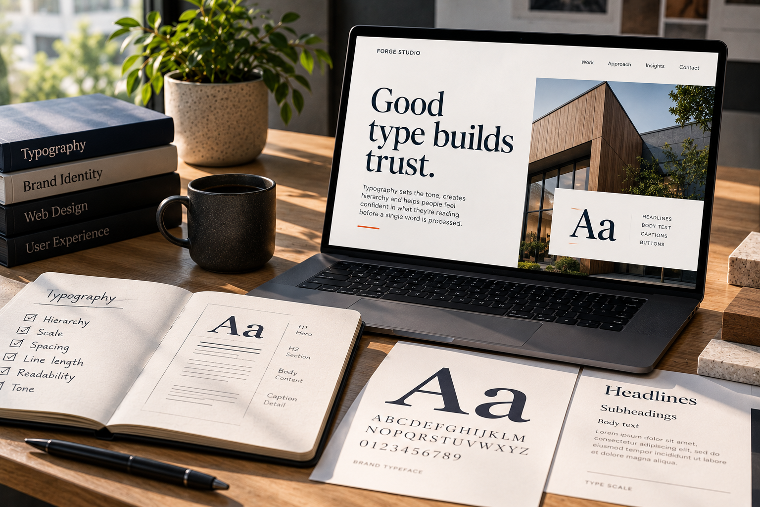
Typography carries tone before content has been processed.
- Precise.
- Institutional.
- Warm.
- Technical.
- Editorial.
- Playful.
- Established.
Those impressions happen quickly.
Type creates a voice
Two websites can use identical copy and communicate very different things because of typography.
Typeface is part of it.
But typography is larger than typeface selection.
- Scale.
- Spacing.
- Line length.
- Weight.
- Hierarchy.
- Rhythm.
All influence how information feels.
Typography establishes hierarchy
A good typographic system helps someone understand the relationship between information before they read everything.
- What’s primary?
- What’s supporting?
- What’s a label?
- What’s an action?
- What’s a detail?
That hierarchy makes a website easier to scan and easier to trust.
Restraint matters
More typefaces rarely create more personality.
Often they create noise.
A strong system can do a great deal with a small set of carefully selected styles.
Variation should have a reason.
Brand and usability have to coexist
Typography needs character, but it also has work to do.
- Text must remain readable across devices.
- Contrast must hold up.
- Line lengths need to be comfortable.
- Responsive scaling needs to preserve hierarchy.
A distinctive type system that becomes difficult to read isn’t successful.
Trust is built through small signals
People don’t consciously say:
This line height makes this organization feel credible.
They simply experience a site as considered—or not.
Typography is one of dozens of details contributing to that judgment.
That’s why visual design in our custom website work isn’t decoration applied after strategy.
The details communicate. And type is one of the first details people encounter